Monday, May 4, 2009

This ain't yo mamma's vin diagram!

The following diagrams represent my thoughts about the topics of this class (Human, Nature, Image) at the beginning and at the end of the semester. Please click on the image to expand it.

BEFORE


AFTER


Note that the "after" diagram is much more complicated than the "before" diagram, almost as if the information had been digested and then regurgitated, mixing once-discreet morsels of thought into a soupy mess. Not that the mess is a bad thing.

Though my vin diagrams are a little bit exaggerated, this class has led me to a far more complex way of thinking about nature, humans' relationship to nature, and art that deals with these issues. In the first weeks of the class, I recall being a little confused about whether we were talking about nature, as in fields and canyons and oceans, or nature, as in human nature or the nature of life. In class, I defined nature as excluding things that humans made. Over the course of the semester, my definitions have become both more expansive and more clear. Now, when I talk about nature, I'm talking about something that includes humans and all of our activities and products, no matter how "unnatural" or synthetic. Our first readings, from Gary Snyder's The Practice of the Wild and from the "Nature" entry in The Dictionary of the History of Ideas were perhaps the most influential because they introduced new ways of considering nature and raised questions that I hadn't ever given careful consideration.

Without a doubt the issues raised in this class have had a significant impact on the work that I have been making and the way I have been thinking about it, which I have posted about throughout the semester. Early on, I watched a National Geographic program about homosexuality in animals (a clip is posted below), which has also played a role in my thinking about my work. I'm now framing my work within a discussion about sexuality and what is "natural" and "unnatural". I am quite adamently opposed to the idea that homosexuality is unnatural (as is often argued by those opposed to gay marriage, etc.), and my work is bent on positioning sex, whether hetero, homo, or something in between, as natural.


Monday, April 27, 2009

////Putting slashes where they don't belong is annoying and overly hip///////

I'm pretty thoroughly confused about what the New Museum's 2008 exhibition After Nature was about, or was meant to be about. Without having seen it in person, I'll have to hold off on complete condemnation, but, based on what the website's "online exhibition" offered, all I can say is that I'm baffled - utterly baffled.

Here are some things that I'm baffled about:

1. The title of the exhibition. Is it after nature, as in nature has ended or been destroyed and this is the result of no more nature? Or is it after nature, as in made in the likeness of nature?

The curatorial statement suggests the former, saying, "
After Nature surveys a landscape of wilderness and ruins, darkened by uncertain catastrophe. It is a story of abandonment, regression, and rapture - an epic of humanity and nature coming apart under the pressure of obscure forces and not-so-distant environmental disasters." But I just can't imagine that anyone would spend the time I'm sure it took to put the show together without thinking of the double meaning of the title. So I'm going to assume that it is meant in both ways, which is an enticing idea.

Reading the title as meaning "in nature's likeness," we might expect work that deals with representations of nature. August Strindberg's
Celestograph seems to do this. According to the audio recording of curator, Massimiliano Gioni, speaking about the piece, Strindberg, believed that he had developed a way to photographically record the cosmos, when, in fact, the patterns on his paper were simply caused by debris and humidity. Thinking of this work in the "in nature's likeness" sort of way, we see a irony and fallacy in the hubris of believing that we can understand or record our universe.
August Strindberg, Celestograph, 1894


2. What in the world does the curator mean by the word "nature"? All I can postulate is that Gioni means it in the broadest possible way. Based on the tremendously varied work in the exhibition, it almost seems as if the show is a violent reaction against any attempt to define nature. Ranging from William Christenberry's fairly straightforward kudzu pictures, which deal easily with the conflict between humans and our destructive but beautiful natural environment, to Tino Seghal's irritatingly obscure performance piece, which I suppose is meant to address expectations of what art is and how humans should behave, the show seems entirely incoherent. I just can't imagine why these two artists would ever be in a thematic show together.
William Christenberry, Kudzu with Storm Cloud, near Akron, Alabama, 1981


Tino Seghal at the New Museum in 2008

Are all of these artists talking about nature? Is this just post-apocalyptic stuff? Is this about the breakdown of the natural order? Maybe that's how these artists are connected. If I think about the ideas of breakdown and chaos, I start to understand how some of this might fit together. I love Roger Ballen's work, which was included in the exhibition and relates to the idea of breakdown.

Roger Ballen, Children on bed, 1996

In the audio available on the website, Gioni says the show is about an "image of nature as if it was crumbling and dying and all the energy had been sucked away." This statement makes me think more of apocalyptic environmental catastrophe than of the idea of breakdown as I described above. Perhaps his language is why I'm having such a hard time understanding this show.

Is this a show about nature? I'm not really sure. Gioni apparently grew great inspiration from Werner Herzog, and I think I can see that influence. Herzog seems to understand the world as chaotic and mysterious, and that seems to define this show.


///p.s. The title of the post refers to the stupid tech-aesthetic slashes all over the online exhibition.////

Monday, April 20, 2009

The Harmony of Overwhelming and Collective Murder

I think about Werner Herzog a lot.  Seriously.  I've been thinking recently about the way nature looks through his eyes (or lens).  In his chapter "Comprehending appearances: Werner Herzog's ironic sublime," from The Films of Werner Herzog: Between Mirage and History, Alan Singer makes note of the visual distortions that Herzog makes use of in several films: the heat waves that blur a figure and the collapsing of space created by a long lens.  Herzog lets the camera linger and spin nauseatingly around violent rivers, wind-torn trees, billowing eddies of oily smoke and flame, and grey clouded Andean mountains.  Watch this clip of Herzog discussing the Amazonian jungle during the filming of Fitzcarraldo (a film largely about hauling a ship through the jungle, in which the crew actually hauled a ship through the jungle).  Really, watch the whole thing, it's great.


It's worth noting that he made these statements during some incredibly difficult filmmaking, and it's understandable that he speaks of the jungle with such a snarl.  During the making of Fitzcarraldo, several members of the cast and crew were seriously injured, and Klaus Kinski, with whom the director had a tumultuous relationship (they threatened to kill each other at various points), starred.  Despite Herzog's apparently foul mood, I think he believes deeply in many of the things that he says here, because they show up repeatedly in his films.  His view that nature is wild, opportunistic, amoral, and ultimately unexplainable resonate throughout his oeuvre, and when he says, "But I love it.  I love it against my better judgement," he means that.  Herzog is always trying to come to terms with these contradictions: that he both loves and reviles nature, that humans both conquer nature and are conquered by it.  

Richard Misrach, from the series Hawaii, 1978

In this early Misrach, somewhat uncharacteristic of his work, I get a similar feeling about nature.  This tropical scene, which should seem like paradise based on our expectations of Hawaii, instead is terrifying, like Lost meets Blair Witch.  We get a sense of the violence of the flora, both in its immediacy in front of the lens and in the wild, leggy roots and vines.  I like this picture so much that I appropriated it for the banner at the top of this blog (the colors are inverted).  For me, this image illustrates Herzog's idea of "the harmony of overwhelming and collective murder" quite nicely, the leaves turning into daggers and the vines into snakes.  

Here's a picture that I made a few months ago.  It's currently untitled, but I call it Spidertree in my notes.  I'm very interested in the apparently uncontrolled and uncontrollable forms that nature takes, and my thoughts about this have definitely been influenced by Herzog and Misrach's Hawaii series.  Though in many of his films Herzog pits man against nature, he always understands humans as a part of nature and looks to plants, animals, rivers and rocks as a way to gain insight into what kind of universe we live in and what kind of beings we are - or rather what the nature of being is.  

Monday, April 13, 2009

Old Topographics

While reading this week's selection of articles about and written by the New Topographers, I was particularly struck by how deeply they questioned the practice of image-making and the production of meaning. 

Ben Lifson, in, what I assume to be an introduction to one of Frank Gohlke's monographs (but can't be certain because the reading was unlabeled), writes "he [Gohlke] tries to rid himself of position and to become, in relation to the land, an accumulation of receptivities. "  This is a pretty interesting statement, and is worth dissecting.  The thought of ridding oneself of position suggests striving to make an unbiased picture, which had, I think, a much different meaning in the 1970s than it does now.  Anyone who has been in grad school at Columbia knows that not having a position isn't looked upon too kindly around here.  All of us are asked at one point or another (or in every crit) what our point of view is, what position do we take.  In 1970 though, ridding oneself of position meant not making an Ansel Adams picture.  It meant leaving in the power lines and the trash and the trailer parks.  It meant not cropping out the tourists and their cars.  It meant photographing things as they were.  To become "an accumulation of receptivities" implies that Gohlke's role is to listen to, absorb, and translate the world around him, rather than imposing meaning.  

Lifson ponders on the construction of meaning in landscape photography, saying "Do these pictures originate in nature?  Or are they the invention of a collaboration between the eye and art, and imposed by perception upon nature, which in itself has neither pictorial order nor pictorial style?"  Do Gohlke's pictures, in which he strives to eliminate his own position, rely on the subject of the image for meaning, or it the content formed through the photographer's interpretation of what it there?  

There is something slightly contradictory in all of this.  Social concerns were a primary motivation for Gohlke and his fellow New Topographers.  Lifson goes so far as to call Gohlke's work "didactic" (although he doesn't mean this as a criticism), but also stresses that he tries to rid himself of position.  Lifson suggests that the meaning of the work depends on collaboration between what's there and what the photographer makes of it.  Clearly the photographer always make choices in what to photograph, and Gohlke's picture series are often so tightly focused that we can be certain that those choices are meaningful in themselves.  So there is some tension between telling and showing - does Gohlke create the meaning, or is it already there to be had? 

Frank Gohlke, Aerial view: downed forest near Elk Rock.  Approximately ten 
miles northwest of Mount St. Helens, Washington, 1981

Frank Gohlke, Aerial view: clear-cuts and logging roads.  Vicinity of 
Mount St. Helens, Washington (outside impact area), 1982

The above images are part of Gohlke's series on Mount St. Helens after it blew up.  He was particularly interested in the visual connection between the forests downed by the volcano and those downed by clear cut logging.  This particular pair of images, which sit adjacent to each other in a slideshow on his website, reveal a complicated method of the production of meaning.  Without his captions, we probably wouldn't be able to tell the difference between a forest downed by a volcano (and then harvested), and a forest downed by loggers.  When we realize that human activity has caused a level of destruction resembling that caused by a volcano, the visual similarity becomes enormously disturbing.  Here Gohlke both tells us and shows us what the place means.  The content is carried by both what is there and what we learn from its presentation.  

The contemporary photographer Justin James Reed works in the tradition of the New Topographers.  His work raises the question of whether the style of the New Topographers is suited to current issues or whether it requires modification.  His subject matter, power lines, communication towers, freshly built subdivisions, McMansions, and blank industrial park facades, is highly reminiscent of this forebears' work.  Oftentimes, his style is as well, embracing flat light and neutral compositions. 
  
Justin James Reed, Southampton, New Jersy, from the series Paradise, 2007

Other times, though, his work becomes much more subjective, clearly asserting the photographer's position regarding the subject matter.


Justin James Reed, Thornbury, Pennsylvania, from the series Paradise, 2007

Justin James Reed, Monroe, New Jersey, from the series New Cities, 2006

Robert Adams, Untitled, Denver, 1970-1974

Compare Reed's photographs of suburban development to this image by Robert Adams, made more than 30 years prior.  In allowing the unnaturally rolling lawnscape and the freshly excavated red clay dominate his pictures, Reed places far more emphasis on the his own position.  While Adams' perspective is certainly intentional, revealing the large scale and uniformity of the development, we are much less aware of this image as a photograph than we are in Reed's.  Reed is less reliant on the subject matter to carry the meaning and takes a more active role.  He is less a facilitator and translator than he is a writer.  

It seems as if Reed's approach is common amongst contemporary landscape photographers.  The New Topographers' attempt to rid their work of position isn't so useful in this world.  Now, it seems, making one's position clear, or at least differentiating it from an unmediated experience of the world, is more important.  

Monday, April 6, 2009

Subhankar Banerjee's Propaganda

Subhankar Banerjee's photographs of the Arctic National Wildlife Refuge make for moderately effective propaganda.  Put into use as propaganda, first by democratic Senator Barbara Boxer in her opposition to drilling in ANWR, they follow the rules that govern propagandistic imagery to a T.  

1. They have a relatively simple message that most anyone can understand.  Though not explicitly stated, the basic message is "don't drill in ANWR".  The images and the text that accompanies them give several reasons for this: 
a) It is beautiful.   
b) The native people of this area depend on the natural resources there to survive.
c) Many species of animals use it as an important stop on long, sometimes intercontinental migration routes.
d) Exploitation of this area's reserves of coal and oil would mean large scale disruption of one of the few areas in the US that has gone largely undisrupted by human presence.

2. Almost all of the images are aesthetically pleasing.  Some are romantically beautiful, some rely on abstraction and formal balance, and some use traditional compositional tropes.  The images are not at all far removed from those you see in nature magazines, in calendars, and in nature documentaries and television programs.  They are not surprising, visually challenging, or difficult to look at.

3. The imagery itself does not do a whole lot (this is why it is only moderately effective).  Much of the content of the work is contained in the very long captions.  The images get your attention, and if you stick around and feel like doing a little work, the captions do the heavy lifting.  This is a problem - I'm sure many viewers of this work don't read the very long captions.  More on this later.

Let's look at one of his pictures as an example.  This is a screen shot from his website (which can be seen here); click on the image to enlarge it so that the text is readable.  

Ok, so this picture, Snow Geese I, is pretty typical for Banerjee.  It is quite nice to look at - the golden yellow and the deep blue are a complementary and traditional color pairing, we see lovely curving abstract shapes punctuated by countless points of while, it depicts an unpeopled landscape (which we like), and the landscape pictured is vast (we also like that).  The text tells us that we are looking at migrating snow geese in ANWR, that they are one of ninety bird species to spend part of the year there, and that the US government wants to drill for oil there.  The text carries the content.  It tells us what we are looking at, how we are supposed to feel about it, and why it is important.  The image tells us that the place is beautiful and big and has animals that move through it.  

This is basically the format of a National Geographic image (though oftentimes NG pictures do much more).  As someone who has always been in a household with an NG subscription (including now - you can get a year for only 12 dollars!), I'm pretty familiar with how those pictures function.  It seems that the main difference is that Banerjee's pictures are usually presented on the wall in a museum or gallery, that they are much much bigger, and that, perhaps, they are formally stronger, with more careful and controlled compositions. 

Here is a National Geographic example from their website (see the image in context here): 

Not a whole lot of difference.  Aesthetically pleasing image, caption that warns of the destruction of the landscape.  The caption is shorter, but this image is part of a long article about drilling for oil in Canada.  Of course, I chose an image and topic that would easily compare, but it is not at all out of character for NG.  

More of Banerjee's work:


Our readings this week rave about Banerjee.  Kelley Wilder, in Resource Wars (available here), says, "These are thoughtful and intelligent pictures, made to please the senses in an almost tactile way.  But their raison d’ĆŖtre, their main purpose, is to compose a powerful argument and to feed the intellect."  Wilder argues that his photos depict a "subtle ecology" and counter ideas about wilderness popularized by typical nature photography.  In Reframing the Last Frontier: Subhankar Banerjee and the Visual Politics of the Arctic National Wildlife Refuge (available here) Finis Dunaway argues, "...Banerjee's exhibit and catalog offer a different way to see the Arctic, a perspective that challenges not only the worldview of conservative politicians but also the prevailing wilderness motifs deployed for a long time by mainstream environmental groups."  

While Banerjee's photos are far more nuanced than the "white nothingness" that proponents of drilling described ANWR as, I completely fail to see how these images challenge traditional wilderness motifs.  Both writers argue that, by presenting a lovely picture accompanied by text that describes the location's ecological importance or the doom that might ensue if Republicans have their way, Banerjee is doing something unexpected.  He's not.  These images are expected and unsurprising.

I'm glad these pictures exist.  If they can help protect habitat or change one person's mind about whether or not we should drill in ANWR, they have served their purpose.  During the Bush years and the "Drill Baby Drill" of the 2008 election, this type of imagery should have been plastered on billboard and buses, published in every newspaper, and shown in every museum.  In a world where anyone is uninformed enough to actually think that ANWR is a white nothingness, the environmental movement needs all the propaganda it can get.

The story of the controversy over the Smithsonian's censorship of the captions is a testament to how dangerous the political climate is for the environment.  But it also indicates how little power the images have on their own.  Perhaps it is really the text we should spend the most time talking about.  

In the long run, these pictures don't do anything different.  Tossed around on the internet, they will become unattached to their captions.  Visitors to exhibitions will neglect to read the text, or will forget it as soon as they leave.  Some certainly will be profoundly affected by it, and they will write their senators and protest and pursue careers as ecologists.  But in the end, these images contribute to the myth of the vast wilderness, valuable for its beauty and for the animals it harbors.  They contribute to the notion that humanity and nature are separate things (except for the primitive natives).  They don't ask us to deeply reconsider how we visualize nature.


Monday, March 30, 2009

Phoebe Washburn

In reading "The Comprehensivist: Buckminster Fuller and Contemporary Artists" by Elizabeth Smith from Buckminster Fuller: Starting With the Universe, I was reminded of the work of Phoebe Washburn, whose piece Regulated Fool's Milk Meadow, was featured at the Deutsche Guggenheim in 2007.  The piece is a room size installation, really a self-contained factory made from found materials, which produces grass for its own sod roof.  A conveyor belt shuttles small trays of grass seed through stations that provide water and light.  After the grass is fully grown, a "gardener" transfers it to the roof of the factory where, deprived of light and water, it eventually whithers and dies, completing a full life cycle.  See the images and the unfortunately uninformative video below to get an idea of the installation.  


Like Fuller, Washburn is particularly interested in comprehensive, sustainable life systems. Influenced by modernist ideas, Fuller envisioned these systems as elegant and efficient, practical despite their seemingly extravagant forms.  His designs were meant to be used (many of his domes still are in use); he believed that we could better our lives and world through good, thoughtful design.  Washburn's work on the other hand is remarkably, notably impractical.  Its construction is ramshackle and seemingly random - inelegant but functional, though its function is not necessary.  

In discussing the piece, the artist often notes that she is interested in "making do" with the materials she can find, clearly removing herself from the realm of modernism.  A modernist never "makes do."  A modernist uses the material best suited to the job, the material that works most efficiently, gracefully, and tastefully.  Perhaps this impulse can be blamed, at least in part, for our current crisis of sustainability.  What's the use of making do with an old building when a new building can be built better?  Why patch the old jacket when a new one can be easily bought?  The modernist rejects the homemade, the recycled, and the repurposed, which Washburn clearly embraces.  The design of Regulated Fool's Milk Meadow, references more the shantytowns of third world slums, where modernism isn't even an option, where any material, no matter how ill suited, can be made to provide shelter.  

Monday, March 16, 2009

Also

I also wanted to briefly mention something else from the Manifest Destiny/Manifest Responsibility catalogue that didn't really fit into my last post. In his essay Hogue says, "Indeed, there is a significant connection between moral attitudes toward nature and intercultural relations, especially in the way dominant groups treat the oppressed and marginalized." (pg. 11) He seems primarily interested in the way early American settlers treated Native Americans, but I think his assertion stands outside of this context.

It's quite closely related to how I have been thinking about my own work, particularly after last week's presentation. I've been trying to sort out exactly what connection I am trying to draw between nature and men going to the woods to have sex. (If you happen to be somebody not in this class and want to see the work in question, go to my website jenniferray.net.) In my photographs, I'm hoping to present nature and sexuality in a complicated way that dislodges idealistic notions of both. A culture that holds to a rigid interpretation of what nature is and isn't is likely to have rigid views of sexuality as well. If we imagine nature to be pure, comprehensible, and inherently moral, we may extend that to ideas of what is natural human behavior.

One of the most common arguments that homophobes use against gay sex is that is isn't natural because it doesn't result in reproduction, as heterosexual sex often does. I hope to counter this argument by identifying places in nature where homosexual sex happens and depict the natural world as complicated, sensual, and aggressive. Perhaps nature is amoral, functioning without regard to what is right or fair or as it should be. Likewise, human nature doesn't play by the rules our theologies and ideologies set; these moral codes are artificial.

Tommy, 2009


Shelf fungus, 2008


Hips, 2008


Impression, 2008


Strangler fig embrace, 2009

Go west, young man, and put solar panels on your McMansion!

In Manifest Destiny/Manifest Responsibility: Environmentalism and the Art of the American Landscape, a catalogue for the 2008 exhibition at the Loyola University Museum of Art, essays by Michael Hogue and Peter John Brownlee trace the evolution of American attitudes toward the environment from the days of the earliest European settlers to the mid-20th century. Through the lens of relevant art produced during this time, particularly landscape painting, both essays draw similar conclusions. They assert that the settlement of America was founded on the belief that cultivation (of nature and of other people) was of moral value, rooted in Christian religious doctrine. Over the next 250 years or so, these beliefs gradually morphed with political and cultural trends, from the agrarian populism under Thomas Jefferson to Andrew Jackson's aggressive removal of Native Americans from their land. The story told by these essays ends with the perception of nature as a place for metaphysical discovery and mysticism, worthy of protection, delicate and finely balanced. This brings us to the modernism of the first half of the 20th century, filled with abstraction and color - simplified.

Brownlee and Hogue both legitimately suggest that we can learn much about where we are today by understanding the history of our cultural relationship with the American landscape. This is quite true, but much has happened since 1950 and this moment of environmental crisis in 2009. As scientists issue increasingly dire predictions about what might happen and just how soon that might be, it's worth taking a look at the last half century to see how we got here. I can't really do this justice in the space of this blog entry, but I'll try to connect some dots.

Along with Rachel Carson's Silent Spring in 1962 came a new public awareness of interconnectedness of nature, and out of this came the modern environmental movement. We realized that it was important to not only protect pockets of wilderness, but to also protect the larger ecosystems. It seems that over the last 50 years this understanding has fallen by the wayside, undermined by the explosion of suburbia and the urge to own a piece of nature. Our lives are busy - convenience and willful ignorance allow us to fill in wetlands and flatten mountains without a thought.

Suddenly though, the environment, this delicate thing in need of our protection, now seems a little more threatening. With Katrina at the helm, this current string of natural disasters has shaken us. Nature no longer seems quite so simple or harmonious - the unbalanced nature doesn't simply shatter and die off passively, it seems poised to take us with it. The way we position ourselves in relation to our environment seems to be changing. We've discarded the purity of modernism, where nature is nature and human is human, and replaced it with a new kind of hybridity. It's not the touchy-feely Gaia/Mother Earth interconnectedness of the 1970s; it's a kind of pragmatic, unromantic hybridity - a recognition that nothing is pure or untouched. Our metaphoric hand has even touched the far reaches of the arctic, melting ice that has been frozen for millennia.

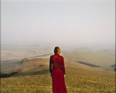
There is something of that hybridity in the Finnish photographer Elina Brotherus' pictures from an ongoing series called The New Painting.

Elina Brotherus, Der Wanderer I, 2003


Elina Brotherus, Der Wanderer III, 2004


Elina Brotherus, Der Wanderer IV, 2005


In this series, Brotherus, herself the figure, stands looking out over vast landscapes, recalling the heroic explorers that populated Romantic paintings of the 19th century (see below). Instead of appearing heroic, these figures are still and quiet, as if contemplating a loss. In comparison with the Romaintic paintings, the expanse these figures survey doesn't seem wild, mysterious, or terribly dramatic. Between the land and the figure, there is no longer the dynamic of conquest and conquerer or protectorate and protector. Both seem rather impotent. The title of the series, The New Painting, reflects the hybridity of the work itself - she has taken the language and subject matter of these old paintings and recontextualized them with a new medium.

Caspar David Friedrich, Wanderer Above the Sea of Fog, 1818

Monday, March 2, 2009

Art, activism, and propaganda: what's an environmentally concerned photographer to do?

In Storming the Gates of Paradise (2008), Rebecca Solnit quotes the nature photographer Eliot Porter as saying, "Photography is a strong tool, a propaganda device, and a weapon for the defense of the environment...Photographs are believed more than words; thus they can be used persuasively to show people, who have never taken the trouble to look, what is there. They can point out beauties and relationships not previously believed or suspected to exist." This statement characterizes well how Porter saw his own photographs - as a tool to persuade people that the environment is worth protecting, and as a way to re-visualize the world in order to convince people that it is beautiful. Although his images generally described a pristine nature, or a least one in which human intervention is not apparent, Solnit considers them to be politically charged. Though rarely fitting into the dramatic model of Ansel Adams sublime landscapes, they showed an environment worthy of protection by virtue of its subtle beauty and delicate ecological relationships.

Eliot Porter, Reflections of Cliffs, Lake Powell, Utah, May 1965


Eliot Porter, Cottonwood Tree, Moki Canyon, Glen Canyon, Utah, April 8, 1963


Eliot Porter, Ferns, Moss, Dripping Water, Redbud Canyon, San Juan River, Utah, May 25, 1962


Eliot Porter, Scum and Branches, Moki Canyon, Utah, September 23, 1965


Though Solnit often repeats her assertion that Porter valued truth more than beauty (by photographing unexceptional things and places, using flat light, filling the frame without a central subject), he clearly does employ beauty. His pictures helped redefine what we find beautiful in nature and create new ways of imaging nature, but also exploited this beauty in support of a particular political agenda.

Solnit's take on Edward Burtynsky's photographs in her article
Creative Destruction (2003) suggests that his photographs are driven by quite a different motivation. She notes that Burtynsky shies away from claiming his photographs to be political statements, though, rightly, she also notes that "facts themselves are political" - the act of putting information into the public sphere via photography is political. While his work has clear political overtones, the artist himself is reticent to account for those overtones, not wishing to hypocritically attack industry. Though I think Burtynsky's reticence may have been motivated more by a drive for self-protection (if you don't stick your neck out your head won't get chopped off), his pictures speak even if he won't. (I think he also has become more politically outspoken in the last few years as environmentalism has become more in vogue.)


Edward Burtynsky, Nickel Tailings No. 31, Sudbury, Ontario, 1996


Edward Burtynsky, Rock of Ages #4, Abandoned Section, Adam-Pirie Quarry, Barre, Vermont, 1991


Edward Burtynsky, Inco-Abandoned Mine Shaft No. 13, Crean Hill Mine, Sudbury, Ontario, 1984


Though the scale of the subjects of Burtynsky's photos is often much grander than that of Porter's, many rely on similar formal strategies, particularly his earlier pictures. In the pictures above, of mines and the runoff from mining, the landscape appears beautiful, as in Porter's images. Color is clearly important in creating beauty, as are the patterns in the rock surfaces and ground. Both photographers made use of flat light and compositions that encourage the viewer to look at the entire picture from corner to corner. Burtynsky seems to draw on Porter's legacy in making this work, using visual seduction as a way to get the viewer to see processes, perhaps otherwise unnoticed.

I would argue that, whether or not he likes is, Burtynsky's work can be situated as environmental propaganda, just as Porter acknowledges his own to be. Porter uses beauty as a strategy to add value to nature, while Burtynsky uses beauty to call attention to subjects we may bypass otherwise. An interesting question then arises: is beauty the only, or best, way for environmentally concerned photographers to push their agenda?

In the 2004 manifesto, The Death of Environmentalism, the authors Michael Shellenberger and Ted Nordhaus describe the failures of the modern environmental movement and a path toward effective policy-making. It makes for a particularly interesting read in the first few months of Obama's presidency, given that many of the strategies it proposes were used during the campaign. Shellenberger and Nordhaus generally conclude that, for environmentalism to make real steps forward, it must be a part of a positive liberal message, calling upon core values (freedom, equality, ect.) and presenting a hopeful future.

I'm interested in where art fits into this agenda. Does art have a role in propagating an environmental message? Although Porter called photography a "propaganda device, and a weapon for the defense of the environment," his work was more complex than mere propaganda. Perhaps his work fits into Shellenberger and Nordhaus' stratagem: it draws upon something we fairly universally value, beauty, to promote the protection of nature.

But for today's world, this seems like a weak strategy for contemporary artists. Beautiful nature has lost its punch. In the wonderful world of the internet, I see new potential. Its egalitarianism offers us a change to see nature in a way that is not mediated by the values of professional image/film-makers. It offers us a chance to re-think the way we understand nature. To see it as something clumsy, messy, and awkward, just like us. Maybe if we can embrace this complexity, understand it as something real, instead of virtuous, pure, and beautiful, we can learn to include ourselves in nature.

I'll leave you with this touching meditation on the futility of life.


Monday, February 23, 2009

Symbolism has consequences: Peace, Harmony, and the Holy Ghost can't bring back the Passenger Pigeon

I really liked swans when I was five. They were so pretty and graceful. In the fairy tales that I read princesses rode on their backs through the night sky and swans floated decoratively in placid ponds in front of castles. Elegant human-swan hybrids leaped through my dreams after I saw Swan Lake.

One day, I went with my family to the Asheboro Zoo, where there was a pond with swans, which visitors were encouraged to feed. You can guess where I'm going with this. This video shows roughly what happened (minus the wedding dress).


The video is actually kind of interesting. The bride, dressed elegantly in white, has been prompted to feed the swan, her symbolic counterpart, probably for the benefit of a photographer. The swan, a symbol of purity, romance, and grace, seems in actuality to be anything but that. I learned a valuable lesson that day at the zoo. I learned that what's real and what's ideal are very different things. Angry, greedy swans are not pretty, graceful, or elegant; they are scary and painful. Symbolism has consequences.


Our reading this week, David Rubin's essay "A Bird Tapestry," written to accompany images in the catalogue for the 2004 exhibition
Birdspace: A Post-Audubon Artists' Aviary, describes the work of 50 artists who use birds in their work. I think it's quite important to note that while the artists USE birds in their work, the pieces often aren't really about about birds. The birds depicted or referenced in these works are almost always used as symbols for human ideals, emotions, and ideologies.


Above is Michael Crespo's 2006 oil painting
The Eye of a Dream. Although the artist was included in the aforementioned exhibition, the painting was completed later, though it serves to illustrate a sort of vague symbolism that seems to be prevalent throughout the selected work. The title of the piece is a dead giveaway. The heron and the flowers represent peace, serenity, grace, though the storm clouds brewing in the background suggest turmoil. I don't know what the bit of architecture in the back is supposed to be. Loosely exotic. Dreamlike, you might say. The painting uses the heron as a symbol. The heron-as-object/idea is more important than what a heron does, where it lives, what it eats.

Other artists referenced seem to use birds merely as an object. They don't really go so far as to even associate the animal with an idea. Rubin mentions Hunt Slonem, who is apparently a very successful artist, saying of his 2000 piece
Toucans (below), "the birds reveal both human and divine attributes - they could be a chatty crowd or a choir of angels."


Seriously? Rubin so overestimates the depth of this piece that I don't even know what to say. It's cheesy abstraction, decoration, fluff. It doesn't tell me much of anything about toucans, humans, and certainly not the divine.

My biggest problem with Rubin's essay is that he doesn't address potential problems with these artists' use of birds as symbols and decoration. I'll admit, birds are pleasing to the eye and offer rich opportunities for metaphor (flight, nesting, eggs, etc.), but they are also creatures. Real live creatures. With real live creature problems, like the dumb brides who insist on getting too close.

I have no problem with symbolism; it's a great way to talk about abstract ideas. But I do have a problem with an exhibition catalogue that fails to note that its supposed subject is loosing the battle against human development. According to the Audobon society, 20 of the most common birds in America have lost more than half of their populations in the last 40 years. (More here.) The real consequence of art that idealizes birds and uses them as symbols is that it fails to talk about the real pressing issues. The art that Rubin describes and the way in which he discusses it are largely out of date, more suited to medieval religious imagery than contemporary work.

Paula McCartney places fake birds in trees and photographs them as if they are alive. On first glance, it seems as if the birds are real, although it quickly becomes apparent that they are fake because of the way in which they are photographed. It's clear that McCartney hasn't used a telephoto lens (space hasn't been condensed), and she is too close to the birds to have caught so many perched just so.

(above:
Bird Watching, (Dark Eyed Junco), 2003)

By placing the fake birds, McCartney makes us aware of the absence of the real thing. Her pictures don't objectify and idealize the birds, as nature photography often does. Instead, they are presented matter-of-factly, in drab forests with drab skies. As they really are. (Or would be if she wasn't using fake birds.)

I started with a when-I-was-a-kid anecdote, so I'll end with one for good measure.

I grew up in the woods. Not a big forest, just can't-see-the-neighbors woods. On summer nights, usually just after I went to bed, we would often hear owls hooting - Barred, Barn, Screech, and occasionally a Great-Horned. My brother and I would get out of bed, and my parents would put the "North American Owl Vocalizations" record (no joke) on the turntable and crank up the volume. We would open up all the doors and windows, and go outside and listen as the record attracted the owls closer and closer to the house. We don't hear the owls anymore.

Monday, February 16, 2009

Save the Krill! Stop Speciesism Now!

My uncle realized early on that the Greenpeace "Save the Whales" campaign was a little misguided.  Sometime in the early 90s he made our family T-shirts printed with "Save the Krill!  Stop Speciesism Now!".  That way, we could all proudly declare our nerdy ecological farsightedness.  Not only is it important to protect the smart, large mammals that don't usually try to kill people, that display significant intelligence and almost-human family structure, and that leap gracefully into the air and land with a big, entertaining splash, it's also important to protect the tiny, maybe microscopic invertebrates that humans mostly don't realize exist (and if we do, we're disgusted by them).  It's pretty easy to convince people to save the whales, mustangs, and Giant Sequoias (even though the realization of this necessity is rarely followed by action), but it's a little more difficult to turn the tide of public opinion for the Cannibal Slug, Rock Gnome Lichen, or Dracula Ant.  While the superstar species of the plant and animal kingdom get all the attention, the vast majority of the planet's biodiversity quietly goes extinct, suffering at the hands of speciesism.  (See Endangered Ugly Things for more info.)

We assign value to species based on any number of factors.  In "The Biophilia Hypothesis" Stephen Kellert and Edward Wilson describe biophilia as "the innately emotional affiliation of human beings to other living organisms."  They outline what they consider to be nine expressions of this tendency which determine human response to and valuation of other organisms: utilitarian, naturalistic, ecologistic-scientific, aesthetic, symbolic, humanistic, moralistic, dominionistic, and negativistic.  Though I don't believe that these responses are universal from culture to culture or through human history, I think they do provide a framework through which to understand the our species' relationships with other species.  
The chart below is a terribly simplified version of these ideas.  I'm particularly interested in two spectra on which we often place animals: beauty and intelligence.  Let me quickly specify what I mean by those terms.  By beauty, I include organisms that humans enjoy looking at, listening to, and smelling.  We may find them cute, graceful, impressive, athletic, or pleasing in their resemblance of humans.  On the opposite end of this spectrum are species that we find hideous, ugly, frightening, monstrous, disgusting, and insidious.  The intelligence spectrum assigns value based on how closely a species' intelligence resembles human intelligence.


Although I think the system by which we value species is far more complicated, these factors seem to be the most important in determining value for Western, post-industrial cultures.  

In "Toward an Aesthetic Marine Biology" J. Malcolm Shick describes the historical trajectory of marine biology-related art and his use of it in teaching his students.  From this, it's clear that when something is aestheticized, it tends to become very appealing to the rest of us.  Seaweed that may actually be slimy, stinky, and bland might be rendered by an artist as graceful, colorful, and patterned.  Once this new, more pleasant version of seaweed is in our head, it slides along the beautiful spectrum (which is only concerned with general human perception, not actuality).  But indeed, someone must have found it appealing initially.  So there is a cycle: an organism rendered beautifully increases its popular value, and beautiful organisms are more likely to to be rendered beautifully.  It's a bit of a chicken and egg thing.  Are there qualities that are perceived by humans as universally beautiful?  Shick quotes T.A. Stephenson (a scientist and artist) as saying: "If we ask ourselves why we find many marine organisms beautiful, we are at once on far more difficult ground...[A]mong the several attributes of natural objects...resulting, in our minds, in the sensation of beauty, the mathematical relations...play an important part...[T]he aesthetic emotion can be vividly awakened even by the shapes of a few lines anx the angles at which they meet each other..." 


Above is a lovely picture of sea stuff by Anna Kirk-Smith, which can be seen online here.  She has given it the heading "for T A Stephenson".

I'm not so sure that math explains all of it, but it does ring true that some of our sense of beauty has been programed into our genes through evolution.  The undiseased fruit is more symmetrical and colorful than the diseased fruit, therefore is safer to eat, and therefore is more beautiful.  Something along those lines.  

But now, it's become increasingly obvious that even ugly things are vitally important to the health of the planet, so we have to shift how we popularly value organisms.